Cup of Coffee
Reflections on Cup of Coffee, 1961
By Rachel Teagle
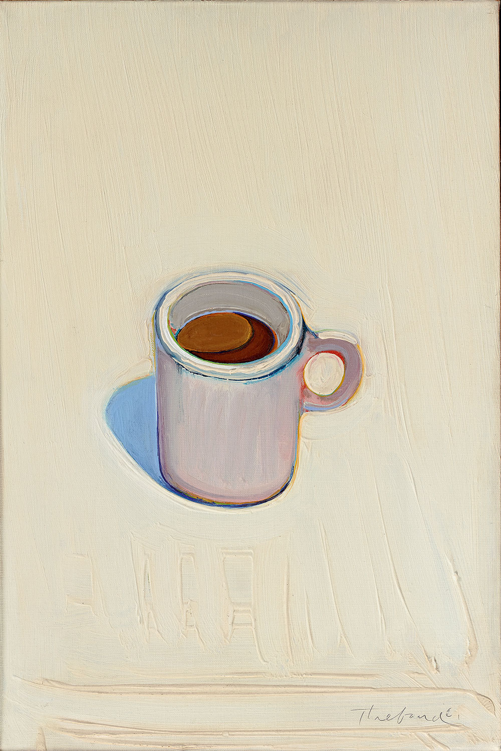
Like so many of Wayne Thiebaud’s paintings, Cup of Coffee is unassuming at first look. This small white painting features a ceramic mug of coffee, just like one you’ve held countless times. In fact, it looks a lot like the IKEA mug sitting on my desk right now. And yet, in 1961 Thiebaud took a plain old “cup of joe” as his subject, and made a remarkable painting at a pivotal moment in his career.
In 1960, at Richard Nelson’s behest, Thiebaud joined Joseph Baird, Ralph Johnson, Roland Petersen and Seymour Howard to establish the Department of Philosophy and Fine Arts at UC Davis. Settling at UC Davis was a decisive moment for Thiebaud, and he painted Cup of Coffee during his first year as a member of the faculty. Soon after, he gifted the painting to Nelson as an expression of his gratitude and esteem, and decades later it entered the university’s Fine Arts Collection as a bequest from Nelson’s estate. Cup of Coffee is truly a collection highlight, a masterwork in its own right, as well as a memorial to the deep personal connections from which institutions and careers are launched.
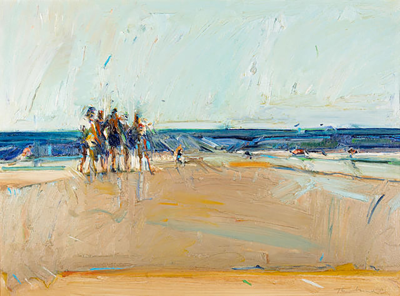
In the few years before his arrival at Davis, Thiebaud had begun developing a language of expressionistic strokes to depict blisteringly bright scenes. Mexican Beach Boys, also from 1961, is typical of Thiebaud’s art at the time: a simultaneously abstract and figurative painting. A thin slice of blue, for example, reads as ocean while it also registers the adjacent color—the paler blue and taupe that each form horizontal bands across the surface of the canvas. Those spindly figures announce themselves as paint marks, and nearly incidentally humans. Likewise, unruly drips (I would wager that the artist carefully positioned these happy accidents) and the thick accumulations of pigment announce that this "beach scene" is really about the activity of painting itself.
Cup of Coffee aspires to something altogether different. The precisely delineated mug embodies simplicity. Formally, the painting is a study of circles: the cup sits dead center, the lip turned up to form concentric circles, with another echoed in its handle, and circles within circles on the coffee’s creamy surface. No errant marks mar the clarity of this vision. Just as we are getting a sense of Thiebaud’s subject, the background comes into view. The white ground behind the coffee cup at first appears to be a “blank” field whose sole purpose is to highlight that glorious cornflower blue shadow. But Cup of Coffee’s white ground achieves so much more.
Bold vertical brushstrokes establish that expansive ground. They are sweeping gestures, steady in direction and extending the height of the picture. To those of you who are privileged to know Wayne Thiebaud, this might seem crazy, but in the subtlety of white on white, these are showy brushstrokes. They are so wide and tall that we can see the ridges of his marks. They abruptly terminate just above a wide horizontal swipe that highlights the artist’s signature at bottom right. These brushstrokes are very different from the shorter, faster, allover motion on the surface of Mexican Beach Boys. In Cup of Coffee, Thiebaud’s marks proclaim confidence, bravura even.
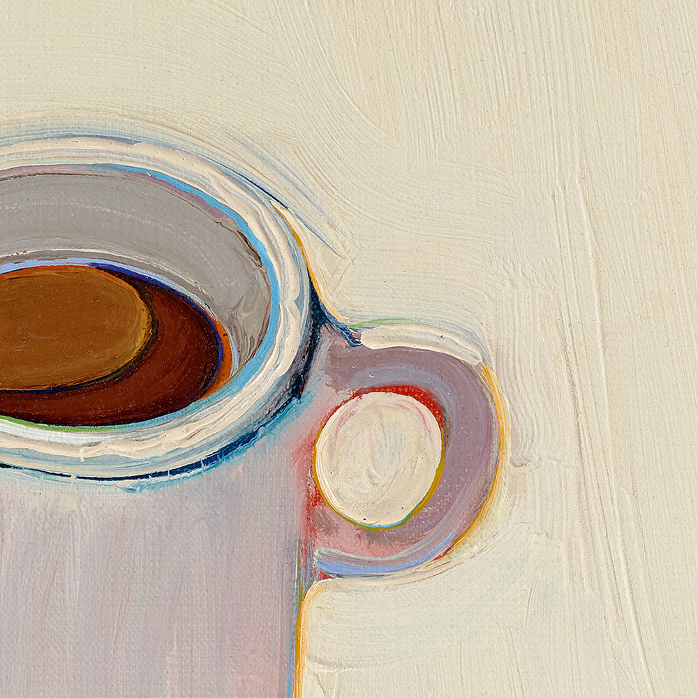
Set against this boldly executed white palette, Thiebaud made a significant discovery with tiny passages of color hugging the cup’s rim, handle and interior. A decade later Betty Jean Thiebaud described Thiebaud’s approach to what he would later identify as “halation.” “He begins a painting,” she narrated in a film about her husband, “by drawing in color with the brush in lime green, yellow and orange. These lines of color leak through and are eventually restated, clarified, and become a transition between forms, giving a glow or halation to the edges heightening the color.” Cup of Coffee’s handle is circumscribed by lime in its center, a golden yellow holding its outside edge. The cup’s rim is held by strokes of the same azure as Mexican Beach Boys’ horizon.
“I don’t think I am much of a colorist,” Thiebaud wrote in an artist’s statement he drafted in the same year he made Cup of Coffee. “My main interest is with contrasts of great intensity,” he wrote. This was a lesson the artist learned from Josef Albers’ landmark color studies. “In visual perception,” Albers explained in Color Interaction, “a color is almost never seen as it really is—as it physically is.” Albers went on to demonstrate the relativity of color—that is, how colors take on aspects of adjacent colors. Thiebaud activated Albers’ ideas by organizing complementary colors into thin bands that define the edges of his objects and seem to radiate light. Thiebaud discovered that the smallest amount of electric color enlivens an entire canvas, giving the most commonplace of objects new life.
Thiebaud ascribed his approach to halation to living in the Central Valley of California. In 1969, he explained to an interviewer, “If one goes out into the sunlight and looks at a shadow, the longer one stares, the more differences one notices. One begins to see its color composition, that its edges have a different color than its inner part, that one can see the edges of the edges.” To “see the edges of the edges” is paramount for Thiebaud, and it is not an easy thing to do. It takes clarity of vision and patience, as well as a belief that everything around us is worthy of sustained looking. Cup of Coffee teaches us, as Bruce Nauman likes to say about his mentor, how to pay attention.
Rachel Teagle is the founding director of the Jan Shrem and Maria Manetti Shrem Museum of Art. She came to UC Davis in 2012 with more than 16 years of experience of engaging new audiences with contemporary art. She curated the exhibition Wayne Thiebaud: 1958-1968 and edited the catalogue, to which she contributed the essay “Presence from Absence: Wayne Thiebaud and the Future of Painting.” Teagle holds a Ph.D. in art history from Stanford University (2002).
